


2
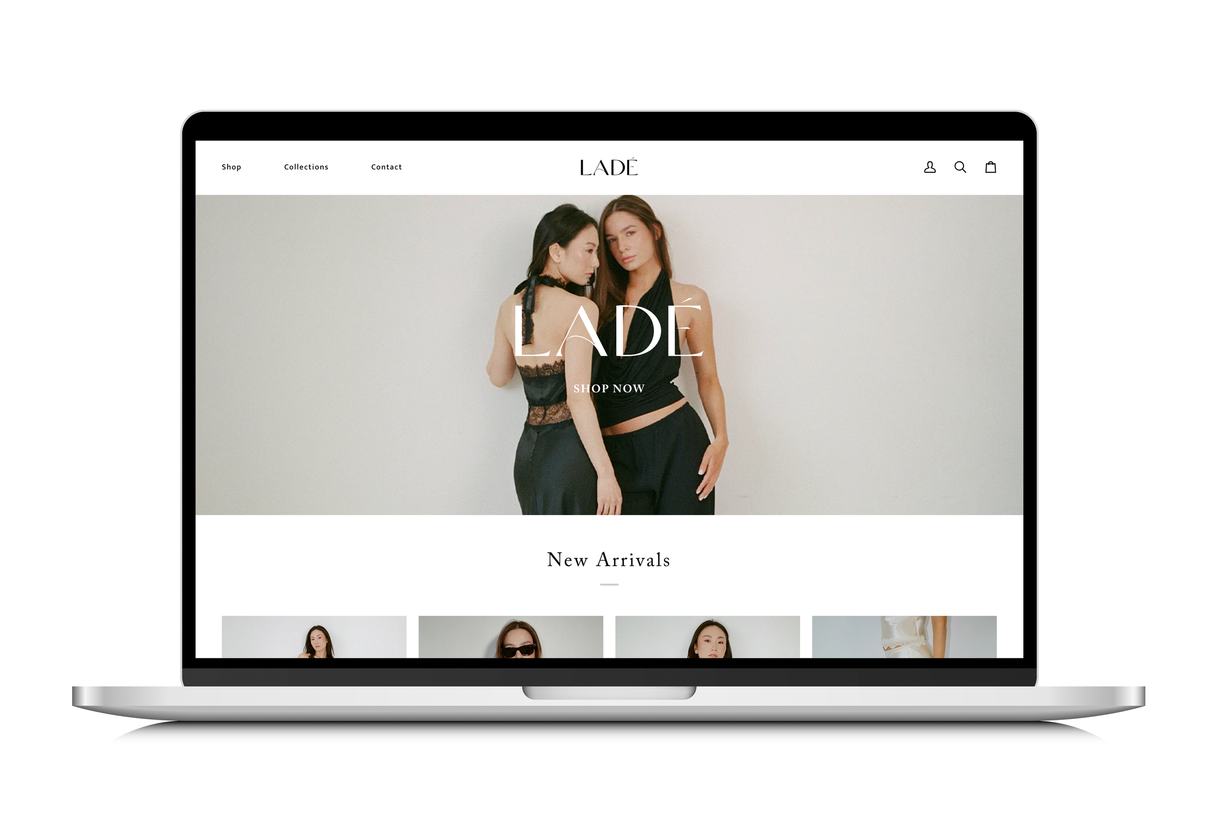
LADÉ

2
Cali

1
Levain Bakery

2
SWET

1
Greenlane

1
The University of Tampa

1
Tampa Pickleball Crew

1
Marchesa

1
Baked Bags

1
Sunny Creative

1
Buy A Bar, Give A Bar

1
Florida Wild - Path of the Panther

1
Heritage Vineyard

3
Lakeland Magazine

1
Honey Jewelry Email Campaign

0
Lyranda L-Lysine Packaging

6
Alessi :15 Videos
1
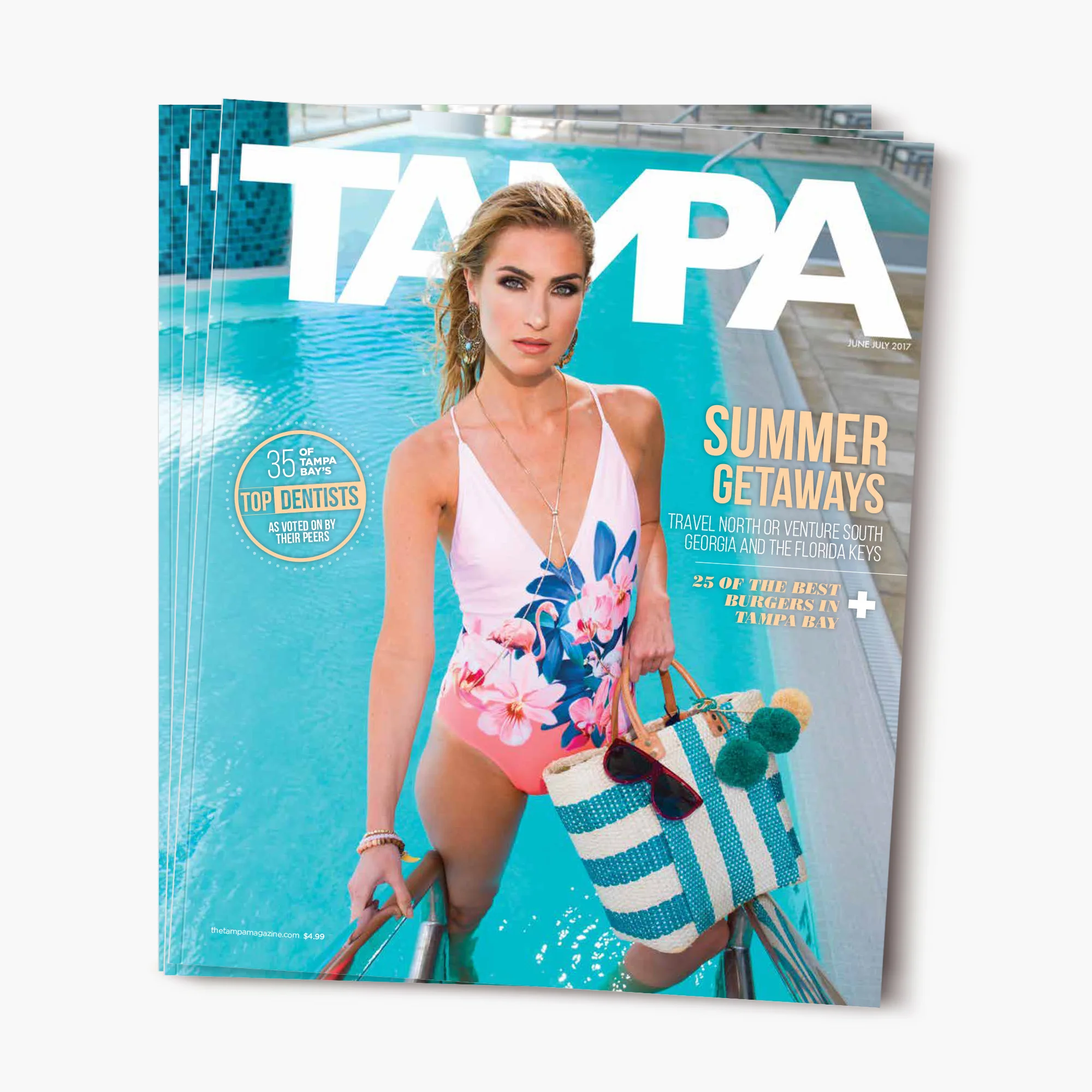
Tampa Magazine June/July 2017 Cover

2
Tampa Downtown - Cover & Feature Story